yellow design developed a brand strategy that focuses on the themes of nature, sustainability and recycling. The naming and the design of the logo should communicate the core competence of the sustainable writing instrument series.
This resulted in the brand name »econovo« with a graceful leaf as the letter. The design of the logo clearly picks up on the theme of nature with its rounded letters in combination with floral elements. The leaf symbolises nature, awareness, authenticity.
The chosen typography is based on circles and visually leans on the radii of the writing instruments to create a clear link from brand to product and thus a holistic brand image.
As a unifying CI element, waves form a very vivid adaptation of nature. Through the translucent colour surfaces of the key visual, the colours unite with the packaging material and form a harmonious unit.
NATURE, SUSTAINABILITY AND RECYCLING AS CORE COMPETENCIES OF ECONOVO
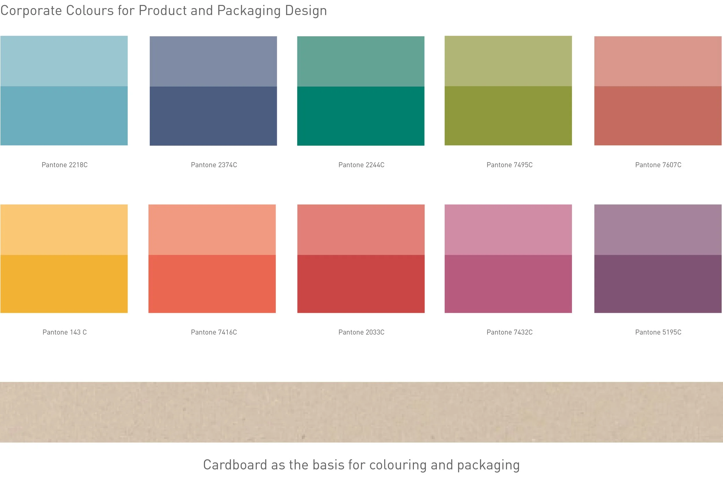
The colour scheme for the econovo range is based on the impression of natural paper, which is characterised by purity, recycling and a reduction to the essentials.
The result is that »cardboard« is used as the essence of CI and as a material for packaging for econovo's products. The impression is characterised by a light, warm-brown cardboard with a soft paper structure.
In view of econovo's expanded product range, the colours are used as colour coding – according to the product group.
To reinforce the theme of »recycling« on the packaging, yellow design has developed a series of icons that show the percentage of recycled materials in the products to create an informative layer.


